How to Create Great Website Experiences Without Fancy Designs
A 4-step process to make your website “ugly” but extremely useful
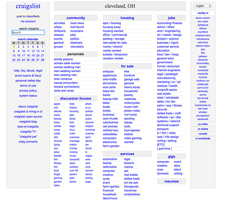
Craiglist’s website is ugly, but extremely useful
By most standards, Craigslist is not a well-designed website. It has no graphics, too much text, and no color variations to emphasize important information it contains.
Despite all those design flaws, Craigslist is one of the most popular website on the internet, with over 60 million users visiting the website per month in the U.S. alone.
In fact, this “ugly design” phenomenon does not apply to Craigslist alone. If you look at Amazon.com, the most popular internet retailer retailer (shown below), you will also see a design that places a lot more emphasis on delivering the information it needs to deliver, rather than emphasizing on visual appeal.
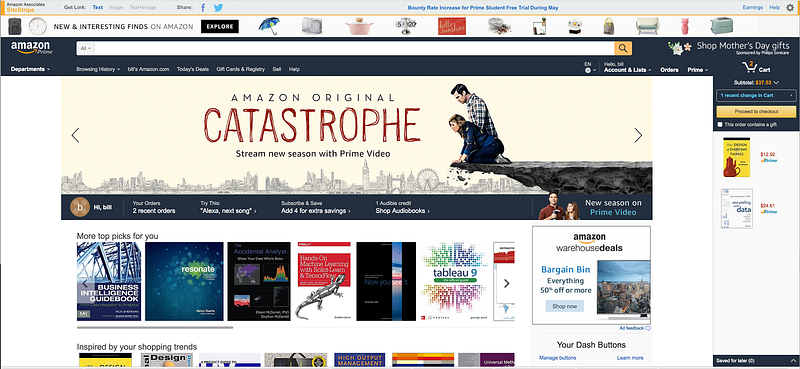
The reason websites like Craigslist and Amazon are so popular despite blatant “design flaws” is that those websites place a lot more emphasis on functionality, and sacrifice pleasing design for near perfect information flow (or UX design).
With great information flow, customers of those website can accomplish their intended goals very quickly, whether that’s posting their grandma’s couch for sale, or buying a new mug.
In the modern world where human attention span is less than a goldfish, designing for function and information has become more important than designing for visual effects, and this article will show you a 4-step process to design perfect information flow on your website with the help of Google Analytics.
Step 1: Identify your ideal information flow based on executive and visitor feedback
Let’s start by imagining the ideal information flow on our website. Then, work backwards to construct it.
To determine that ideal information flow, you need to understand the purpose of the website from two perspectives: 1) as the owner of the website, and 2) as a visitor of the website.
Let’s start with the perspective of the owner of the website. Very often, I would hear owners of websites telling me that “I want my website to do everything.”
However, it is not a wise decision to have a “swiss army knife” website because an overly complex information hierarchy will not only obstruct visitor experiences by causing confusion, but also make the optimization process extremely labor and time intensive, reducing the return on investment.
To help you overcome this “swiss army knife” mentality, here is a good exercise, inspired by Warren Buffet:
Look over your website, and write down 5 or more potential use cases (learning more about the company, shopping for your product, etc.) of your website.
Look over those use cases. Eliminate the ones think that are less important, and erase them completely from your mind. Distill it down to the 3 most important use cases you want to optimize for your website.
After you have filtered down to the 3 most important use cases of your website, map out all the pages and events (such as a button click) required to go through these 3 use cases.
During the third step, you may encounter different variation of the same use case along the way (for example, go directly to the product catalog and then checkout vs. look over the popular product page and then go to checkout).
Try to pick the three most frequent iterations of each use cases — you will have a better idea of which path to choose when you look at it from your visitors’ perspective.
However, only the owner/executive’s perspective is not enough. Many times, how you think your users will use the website and how they actually use your website are drastically different. Therefore, you need to empathize with your actual users and consider how they use your site.
This is where Google Analytics comes in. It provides you with a “Behavior Flow” module in which you can understand how your visitors are currently using and flowing through your website.
The “behavior flow” function of Google Analytics can be found under “Behavior -> Behavior Flow” section of Google Analytics, and the analytics dashboard looks like the picture below.
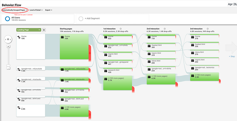
In this module, you can see how users interact with your website with great accuracy. As you are going through all the content flows, you can very quickly identify common ways people interact with your website.
For example, just through the “1st interaction”, we can see that people uses the Google Merchandise Store in three distinctive ways (illustrated in the image above):
Signing in directly to make purchases (most likely repeated customers).
Browsing through the product promotions on the homepage (most likely new customers).
Search product directly via internal search (most likely customers with clear intentions of purchase).
After familiarizing yourself with the interface of the Behavior flow module, go back to the list you came up with your owners/executives, and see whether you can find any of the business owner’s pathways in the Google Analytics behavior flow map.
At this stage, you can also adjust your list of frequent use cases accordingly and add unexpected pathways that your users have trail-blazed (we call this process adoption).
Finally, sit down with your executive/owner again and make two final lists: the pathways to optimize, and new pathways to create.
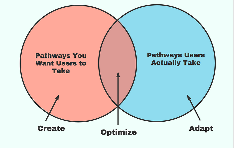
The “pathway to optimize” are pathways that users frequently take on your website. The “pathways to create” are pathways that are currently unused that require nudging the users to adopt.
For your own sanity, pick at most a total of 10 pathways in either category. Tracking any more pathways at the same time can be too time consuming.
However, as a personal recommendation, avoid choosing “pathways to create” since it usually involves a lot more effort with at best uncertain outcomes.
Step 2: Set up appropriate goal tracking in Google Analytics to keep track of the pathways
After you have determined your ideal pathways, you need to set up goals in Google Analytics to keep track of them.
You can find the goal management feature of Google Analytics at the third entry under the third column of the admin tab (pictured below).
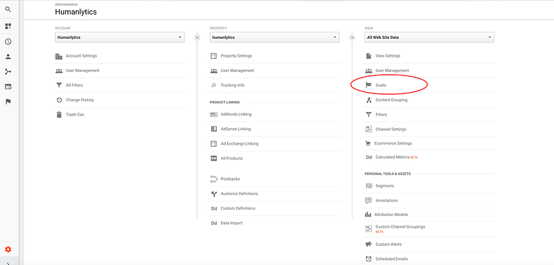
Here, for each of the pathways you have defined, create one goal in the screen below.
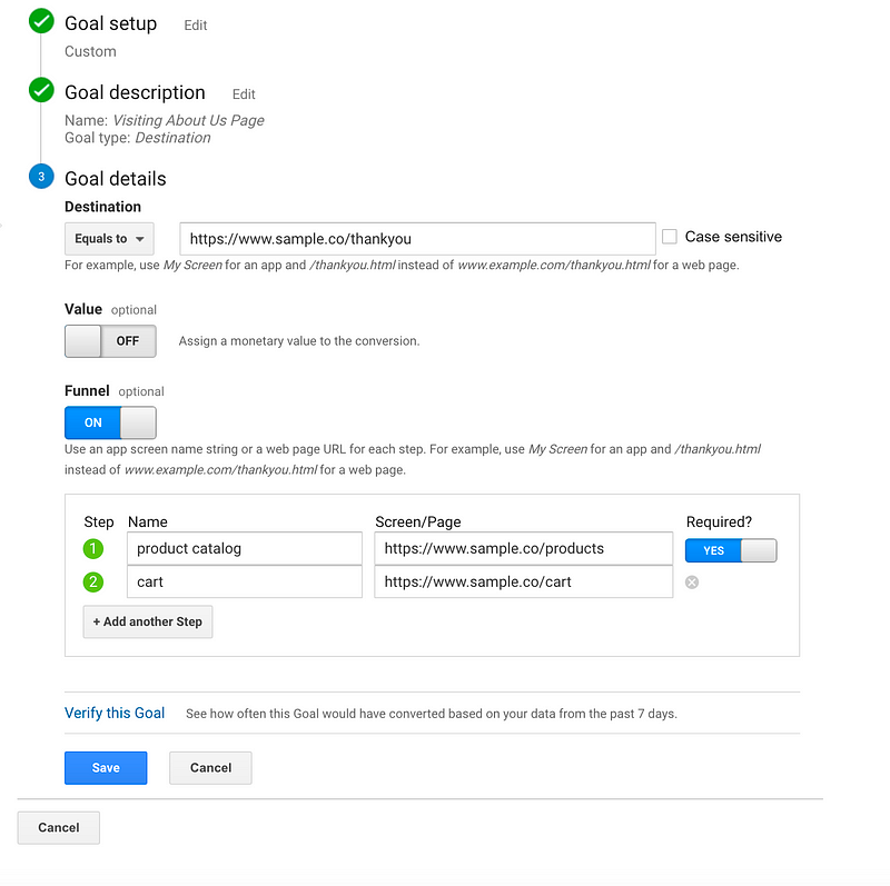
In this image, I have shown a goal-creation process for a hypothetical checkout pathway. Reference the setup listed above so only that specific pathway is being tracked by Google Analytics.
After you have finished setting up, click on the “Verify this Goal” button to make sure your goal is working — you will be surprised how often it does not.
To complement what I have described here, you can reference this official goal-setting guide by Google Analytics if you want to learn more about goal setting and creation.
After setting up the goals, you need to wait for enough data to be collected. It is usually recommended to wait for at least 2 weeks for meaningful amount of data to be collected and adjust for sudden traffic increases from events such as promotion. Depending on the daily traffic of your website, this may take longer or shorter.
Step 3: Identify weaknesses in the selected pathways, and come up with optimization steps
After creating sufficient data for each of your pathways, it is time to start analyzing.
To view the data collected for each of the pathways, go to the Conversion -> Goals section of Google Analytics.
In the “overview” section, you can gain a general idea of how frequently each of the pathways are being completed by your users. Prioritize optimizing each pathway according to their importance in meeting your business objective and their frequency of use.
After ranking the pathway priority, let’s dig into each of the pathways and identify what is preventing the ultimate goal from being met.
To do that, visit the “funnel visualization” section. You will see a funnel similar to the one below:
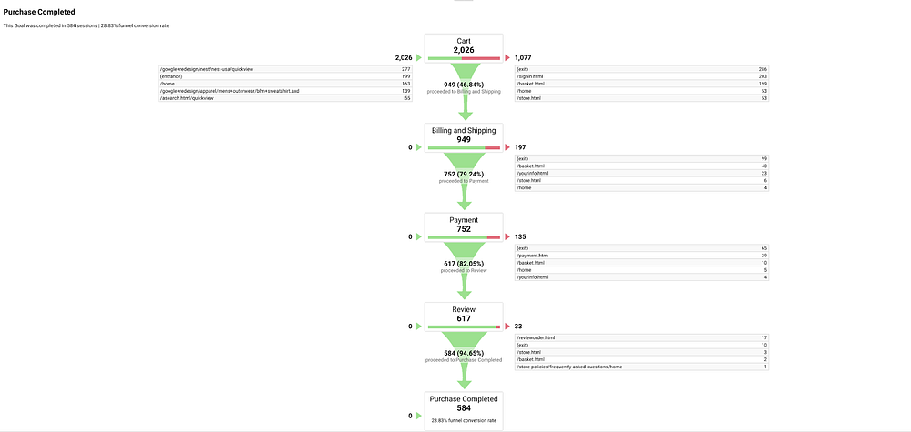
From this visualization, you can easily identify in which step users are dropping off and leaving the pathway, and the pages of those specific steps should be the focal point of your optimization efforts.
For example, in the case of Google Merchandise Store, the biggest problem they are facing is that users are leaving the website after placing items onto the cart. This is a classical “cart abandonment” issue, and they can resolve this by offering a deal at the cart page if visitors checkout now, or send follow up emails to make sure visitors return and complete the purchases.
After identifying the weakness of your user pathway, it is time to extract ourselves from Google Analytics into the real world.
Go onto those specific pages and make few hypotheses of why users are dropping off on those pages, talk with your users to validate those hypotheses, and come up with few action steps to optimize your page.
Step 4: Monitor and Iterate Based on the Results
Implement those action steps in the last step, and it is time to wait for enough data to be collected again (once again, 2 weeks).
Compare relevant metrics such as “total number of goals completions”, and “drop off rate” with the previous period to identify whether the change was effective. Rinse, and repeat.
One tool that might be of particular help during this step is the Google Optimize, which was recently made available for free for all users.
Through Google Optimize, all your metrics can be tracked automatically and you can tell whether your changes are effective without having to stare at multiple sections of your Google Analytics every day.
Tracking all your metrics is the easiest the to perform, but the hardest to perform consistently.
It require a culture of continuous improvement within your organization. Just like how a single physical workout can be fun and engaging, motivating yourself to go to the gym on a consistent basis requires a strong willingness to constantly improve.
At the end of the day, there is really no magic in web experience optimization — websites like Amazon.com spend million if not hundreds of millions of dollars on optimization every single elements of their websites.
Even though the method I recommended here is much more general and takes less effort, it still take some time and constant commitment to make your site visitors really love your site.
With all that said, I hope this 4-step process can provide a valuable framework for you to optimize user experiences on your website. Comment below if you have any questions about the method.
This article is produced by Humanlytics. At Humanlytics, we build tools for SMBs that not only help them answer their business questions and track metrics in real time, but also tell them what questions they should be asking in the first place — all with the goal of teaching them how to implement solutions.
Follow us on Twitter, Facebook, Linkedin, Twitch, and Medium to get more information about web optimization and web analytics.
